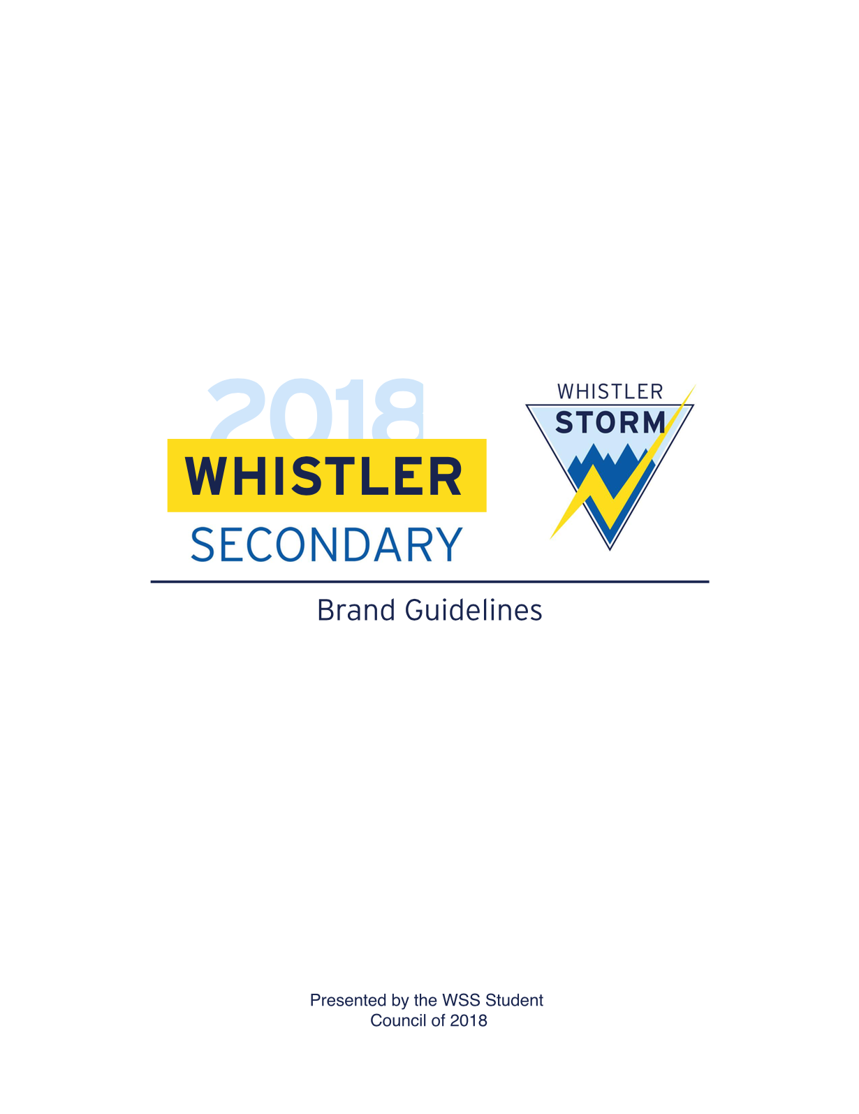
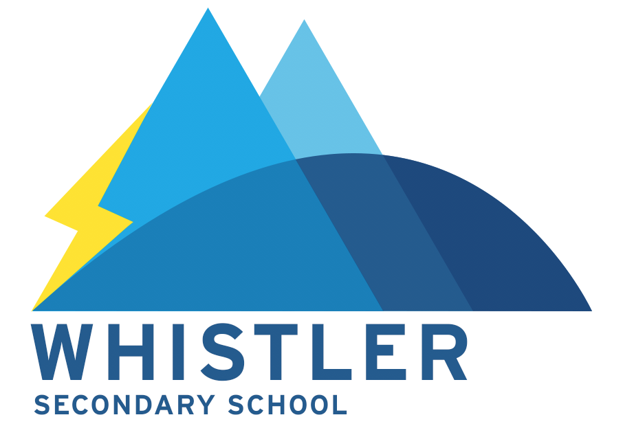
Whistler Secondary. Home to 450 students, the mighty Whistler Storm, and as of this week, a spicy new logo.
Since 8th grade, I had been consistently baffled by our school’s childish and dated looking logo. As a legacy project for my final year in WSS, along with the backing of the student council I set out to modernize and update our school logo and branding. Once we had the initial support of the administration, it was time to start designing.
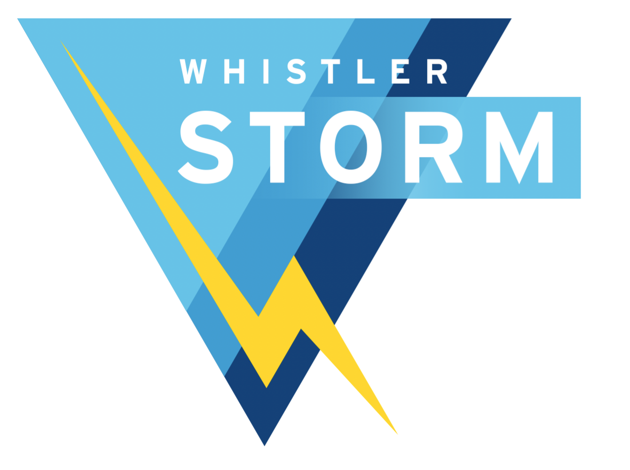
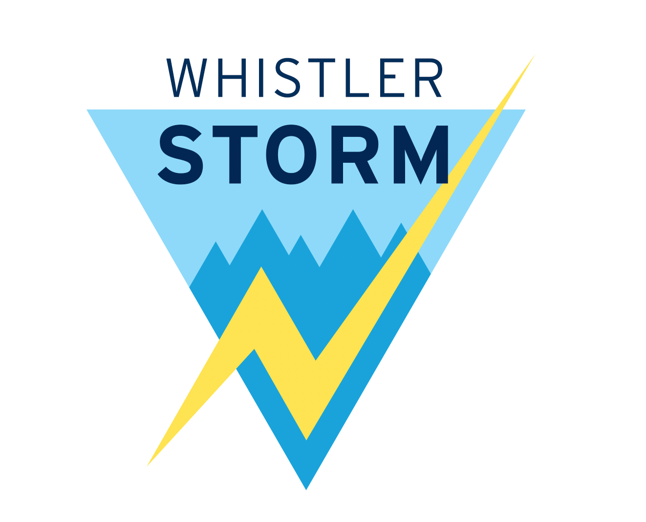
Below is a gallery starting with the original logo, showing a slideshow of various design ideas I touched upon while attempting to create a modern alternative. As you can see, my designs ranged from modern remakes of the old one, to more traditional wordmark-type logos, to completely new concepts.


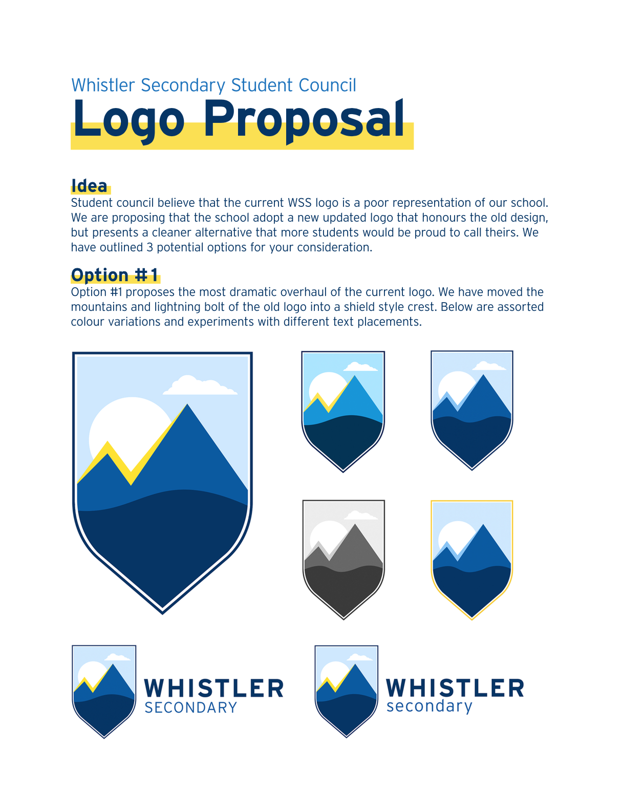
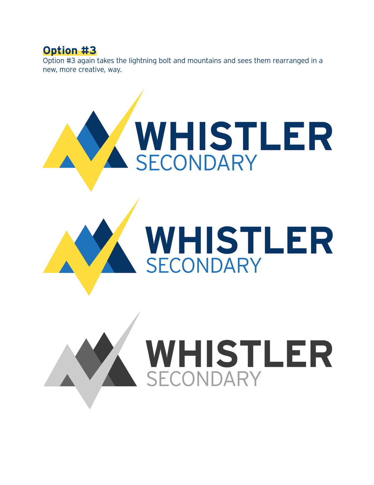
After a few month long process of brainstorming and design, along with my team I was able to narrow it down to three logos that we determined were the best. Below is the proposal we submitted to the administration detailing our three top picks, along with brief explanations of their meaning and design.
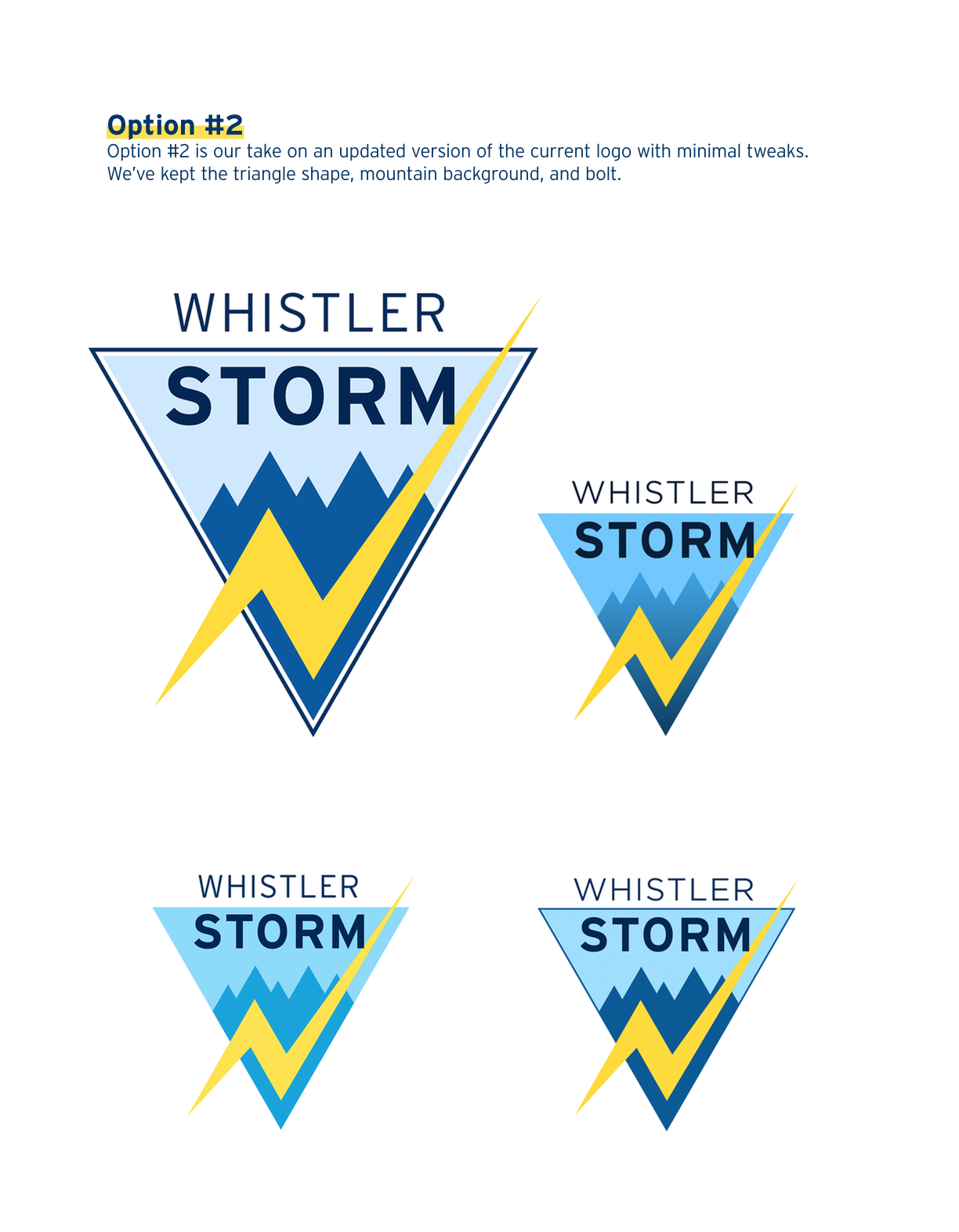
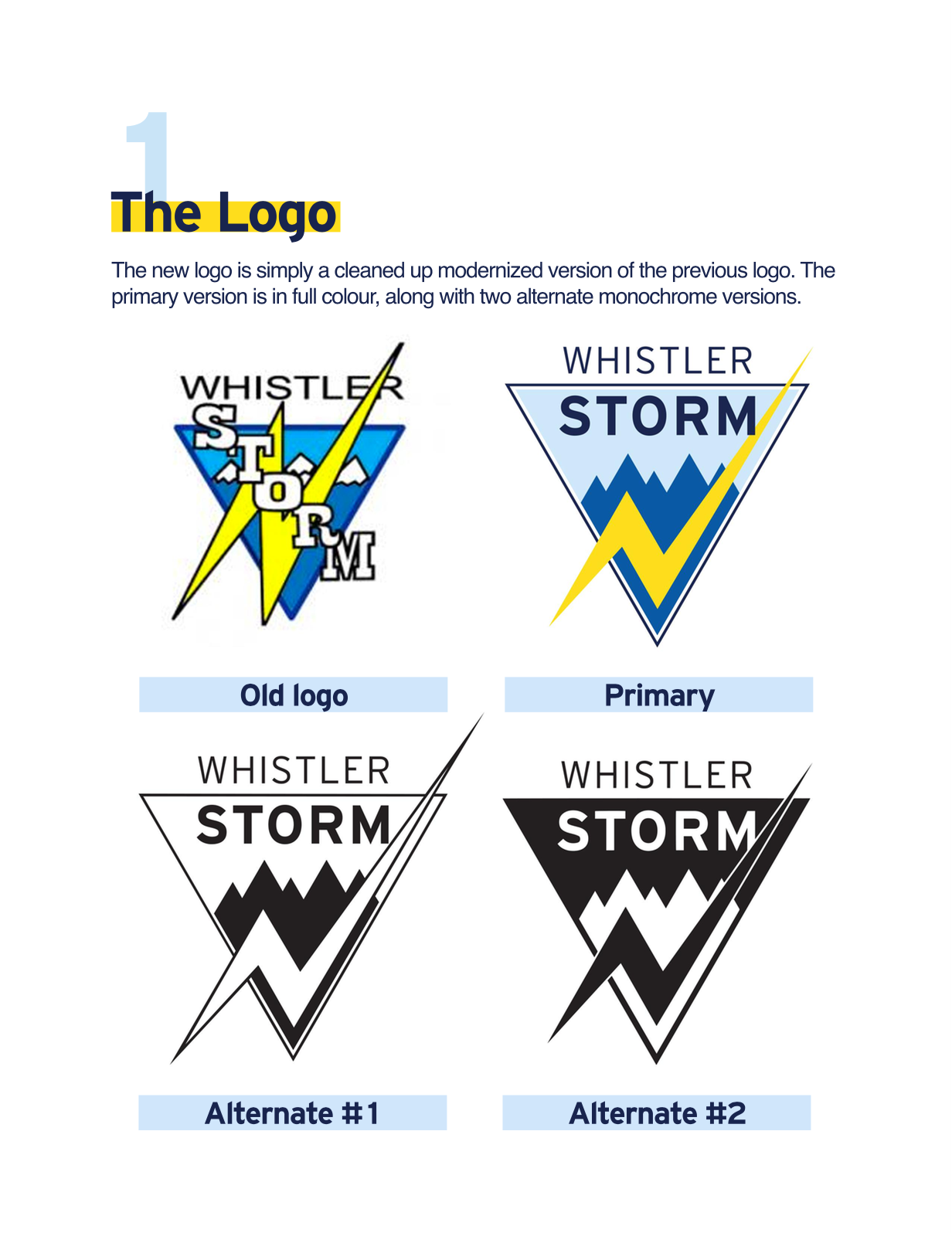
After many rounds of discussion, emails, and lots of debate, our student team finally reached a consensus with the council of teachers and admin who had involved themselves with the project. Because our school is fairly small, with a relatively stable teaching body, many teachers were strongly opposed to changing a logo that had been representative of our school. A few saw our efforts as arrogant and disrespectful, and for that reason we decided to go with the option that was most closely linked to the original logo.
Option #2 it was. Although the administration had agreed in principle to the adoption of #2 as a new school logo, they wanted to see that there was clear student demand for a change. We put a survey to the students, and with a response rate of 87%, 80% of those students who replied said definitively that they wanted to see a modernized logo.

After many months of design work, persuasion, and presentations, we had permission to start the implementation of the new WSS logo.
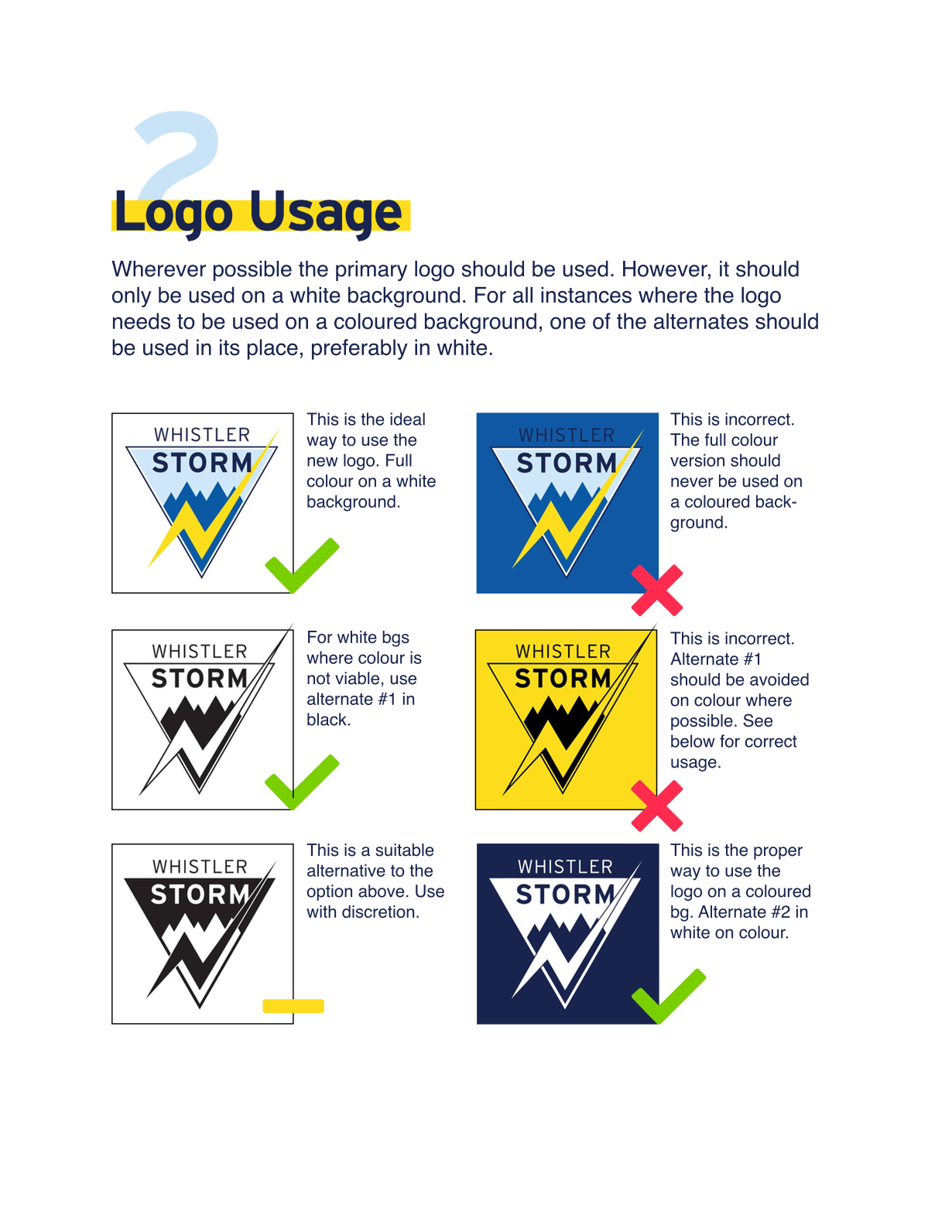
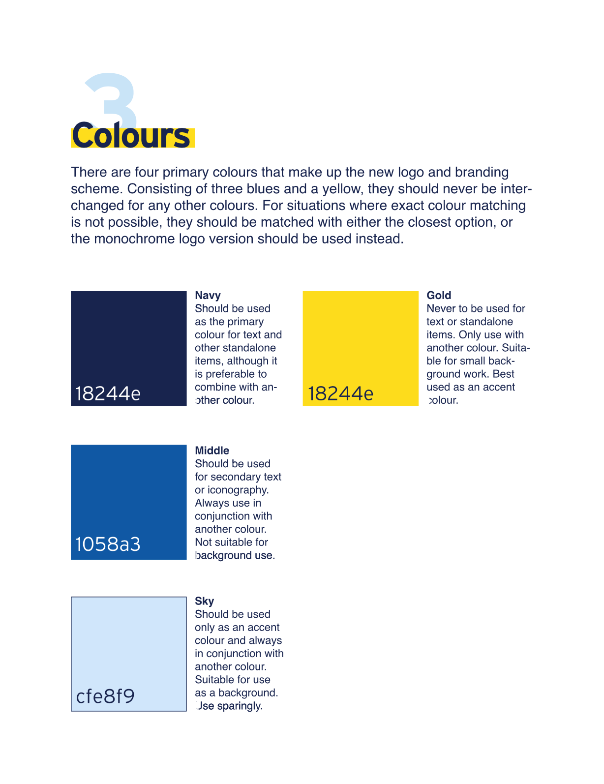
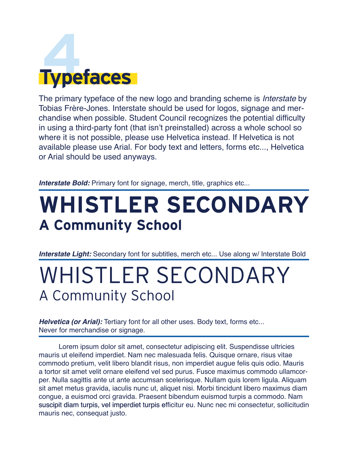
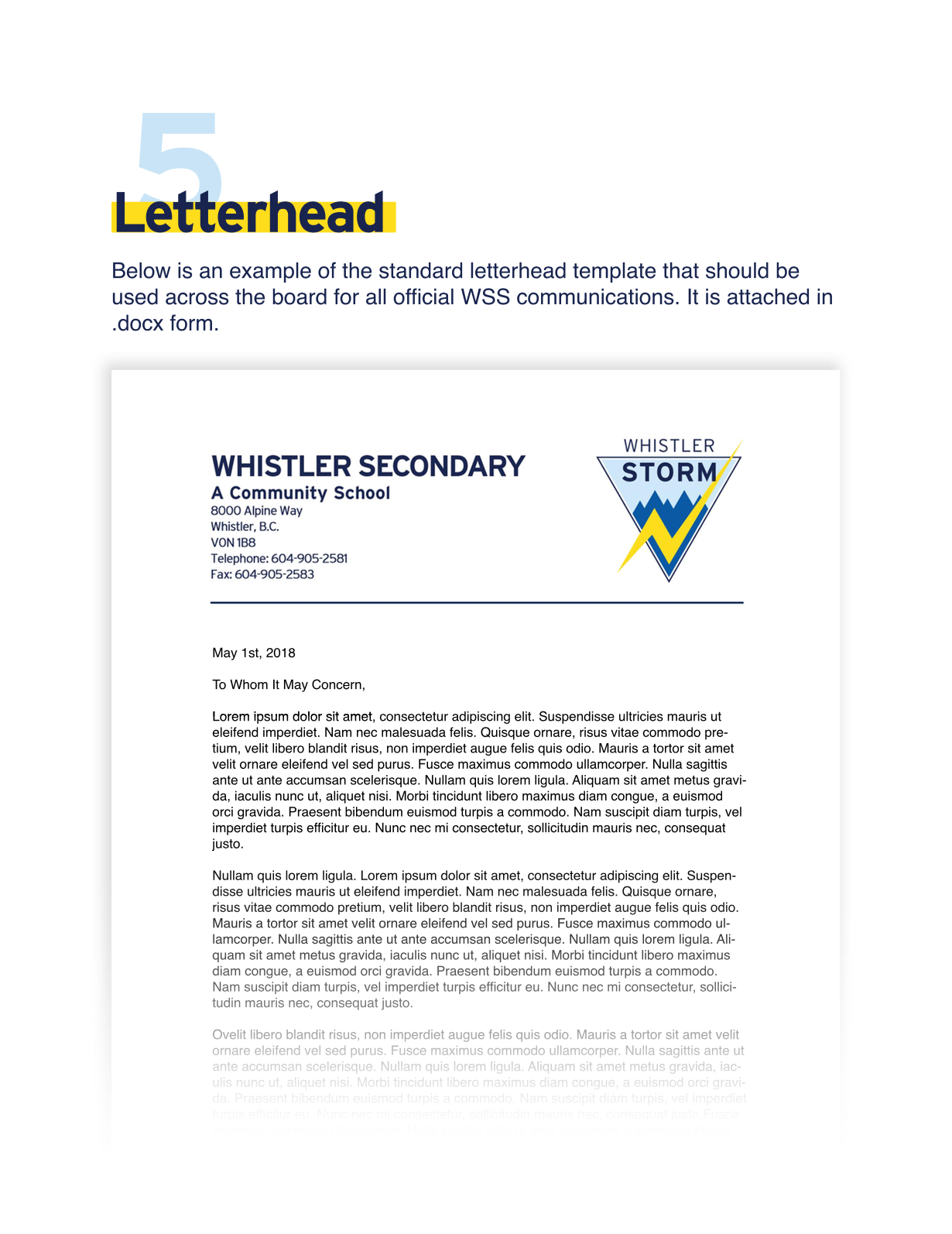
As any designer will know, one of the few things worse than seeing your ideas rejected, is seeing your ideas accepted and then butchered. To try and prevent misuse of the new logo that we had put so much effort into creating, I created a series of “brand guidelines” designed to ensure that the logo was used in the right contexts, in the right colours etc…